Redesigning Sutton.gov.uk
London Borough of Sutton are a local authority in the greater London area; Sutton.gov.uk serves as a central online platform for communication, information dissemination, and engagement between the council and the community it serves (around 200k residents).
Following a period of discovery, Sutton Council identified a number of short-comings across their online offering and I was engaged to oversee the redress of many of these issues and help to deliver a new site for the council.
- Client
- London Borough of Sutton Council
- Project duration
- 12 months
- Role
- User experience design, visual design and front end development

Background
Local authority’s websites are invaluable to residents and business but many unique challenges exist for them; whilst offerings are plentiful, users are often infrequent and require only one specific thing at a time.
Visits to the site are often born of necessity rather than desire and many users arrive to the experience with a degree of frustration. Navigation and discovery is critical, function is paramount but the personality or brand of the locality must also be considered.
A wealth of analytical data was available to review as was user feedback on the incumbent experience.
Project Scope
Initially, the scope of the project was to provide research led and data driven designs to remedy identified problem areas. This included the design of page templates, a new suite of components and a new visual design for the site.
The scope increased during the project to include the re-platforming and migration of the existing site and I was engaged to provide the front-end delivery and integration of the designs cover in the initial scope.
The desired outcomes for the project were to:
- Better communicate Sutton’s identity as an ‘ambitious’ borough
- Provide a consistent experience for users, regardless of accessibility needs
- Increase user engagement and reduce friction with the website
Research
The team agreed to follow the GDS phased agile approach to delivery for this project. Following a comprehensive discovery, we embarked on an alpha phase to test our riskiest assumptions and gather insight into potential solutions to the multitude of challenges identified, followed then by private and public beta phases before eventually moving to a live release.
At the core of this delivery approach lay a user centred design process, research and user feedback were the bedrock. Moderated and unmoderated research methods were utilised to gather qualitative and quantitive insight to measure our design hypothesis’ against.
Competitive Analysis
Whilst local authorities don’t have competitors per se, they do have peers. Greater London has no fewer than 32 borough councils and there are 298 across the UK, which gives plenty of opportunity to compare and contrast online offerings.
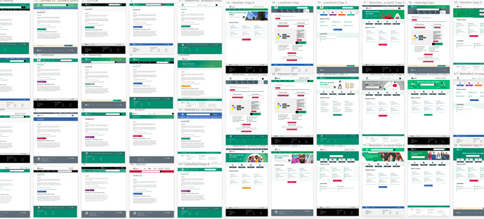
Early in the alpha phase, 50 local authorities were carefully selected to carry out in-depth analysis on. Particular attention was afforded to the nesting and hierarchy of content and services, how this impacted navigation, UI components utilised and use of branding for the visual design elements.
Distinct features were then used throughout multiple rounds of variant testing to begin to understand what might work for both stakeholders and residents. Stakeholders were invited to rounds of ‘5 second tests’ whereby peer page templates were shown for no more than five seconds and the participant was asked to rate the stimulus using a ‘Bipolar Emotional Response Test (BERT)’ using the design criteria from the initial brief.
Ideation
The design process was split into two unique streams, one focussed on optimising navigation and structure of pages whilst the other explored options for visual treatments. It was clear from our stakeholders that a departure from the existing visual design was expected, so a recently produced style guide was used to explore visual treatments that were within the established brand.
For stream one, wireframe variants and navigation methods were produced to consider how content hierarchy and optimal information architecture might be realised.
For stream two, the ‘crazy eights’ approach was adapted to create eight very unique but on brand visual treatments to bring these wireframes ‘to life’. The two streams were very much kept separate until much later in the process.

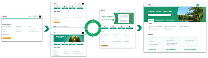
Prototyping
Prototyping as at the very heart of the process. When I joined the organisation, there were no prototyping capabilities and so naturally, the GOV.UK prototyping kit was leveraged. And with it, a bespoke frontend library was created and plugged in to add the emerging visual design.
This responsive prototype was used for moderated testing was split across user’s preferred device which resulted in 45% using mobile devices and 55% using larger devices. Utilising a data driven prototype allowed us to decouple the visual design from the content hierarchy and as such add presentation options as design variants to users.
Our approach was to ‘start naked’, and place a burden of user benefit on any addition to the very base experience. We opted to assemble an experience that best met the needs of users rather than to deconstruct the emergent design that we had inherited.

Testing
The team utilised fortnightly design cycles to hypothesis, test, learn and iterate over nine rounds of testing, loosely speaking there was an 80/20 split of focus across the ‘usability’ and ‘visual design’ streams.
During our alpha phase were conducted over 52 hours of moderated research with as many participants and had unmoderated feedback from over 625 users.
These cycles allowed us identify preferred visual treatments and component variants but perhaps most crucially, an approach to site and department navigation that best worked for our users.
Visual Design
The brand guidelines allowed for a wide range of options for visual treatments. Initially, twenty variants were created and subjected to both moderated and unmoderated tests with residents and stakeholders.
Options ranged from the most stripped back to some fairly ‘out there’ examples. But ultimately, extensive testing with visual treatments suggested that this element of the design had almost no impact on a user’s ability to circumvent the site and discover what they needed.
Implementation
In my experience, implementation is where the ‘rubber hits the road’, it is a vey decisive moment for design. I was fortunate to be in a position to create the component library for the new platform, which allowed for true to intent implementation. Subsequently, I was able to integrate this front-end library into the new platform, create a theme for the new CMS and setup of the required templates.
Iteration
A high traffic department was selected to work with during our private and public beta phases and a parallel site was stood up. Users of the live site for invited to try the ‘beta’ and take up was much greater than expected. Feedback from users allowed us to make additional changes to structuring of services within the site’s navigation before the site was eventually given the green light to replace the old system.